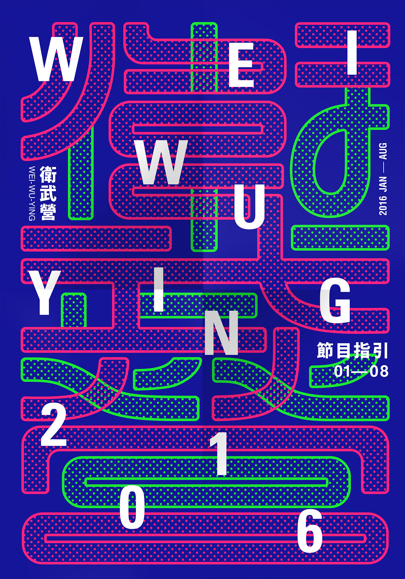
WEIWUYIN 2016 Program Guide
Surrounded by the green field, Wei-Wu-Ying (The National Kaohsiung Center for the Arts, designed by Francine Houben/ Mecanoo), has sonic style exterior with white wave that resembles a big ray fish smoothly slides onto the ground, a seamless blend of the surrounding environment. It is an architectural work full of avant-garde and ecological concept.
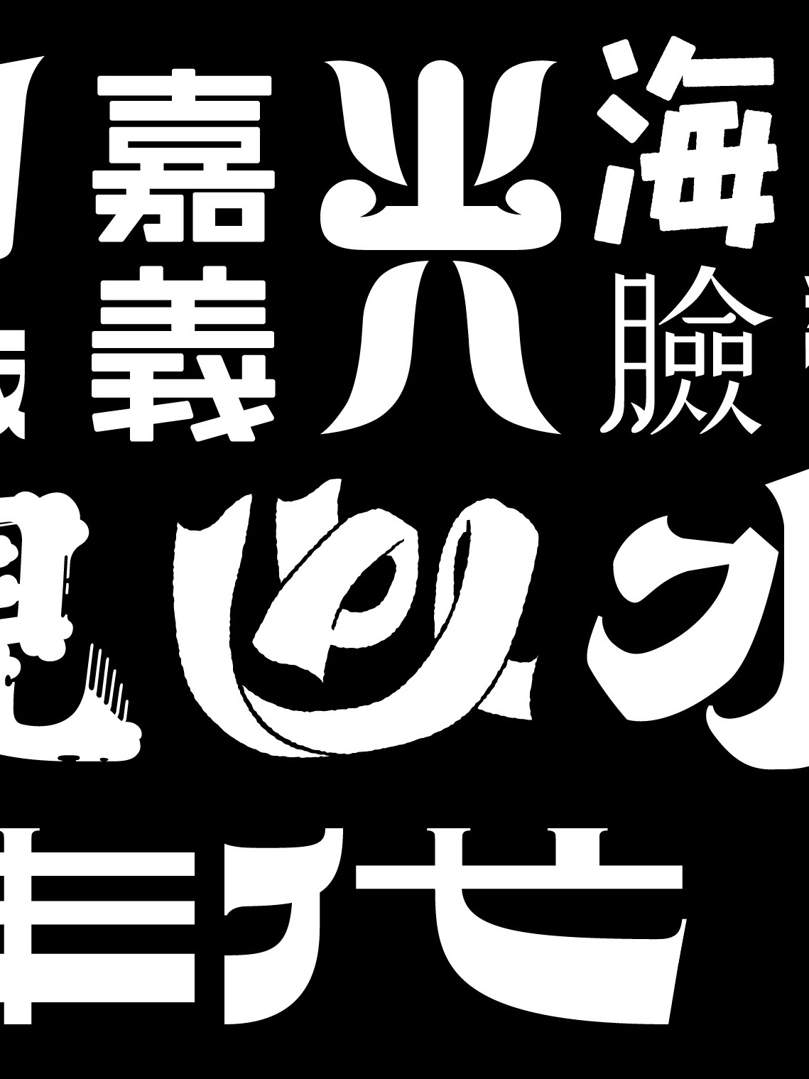
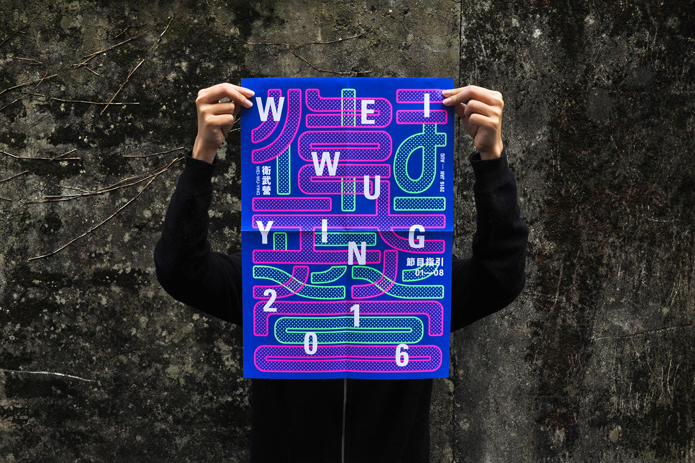
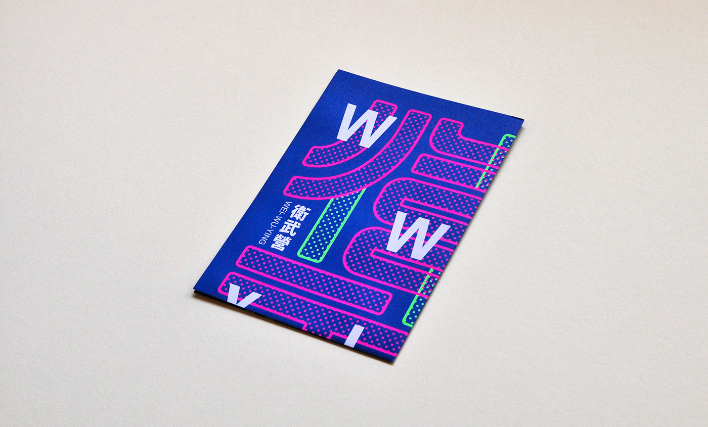
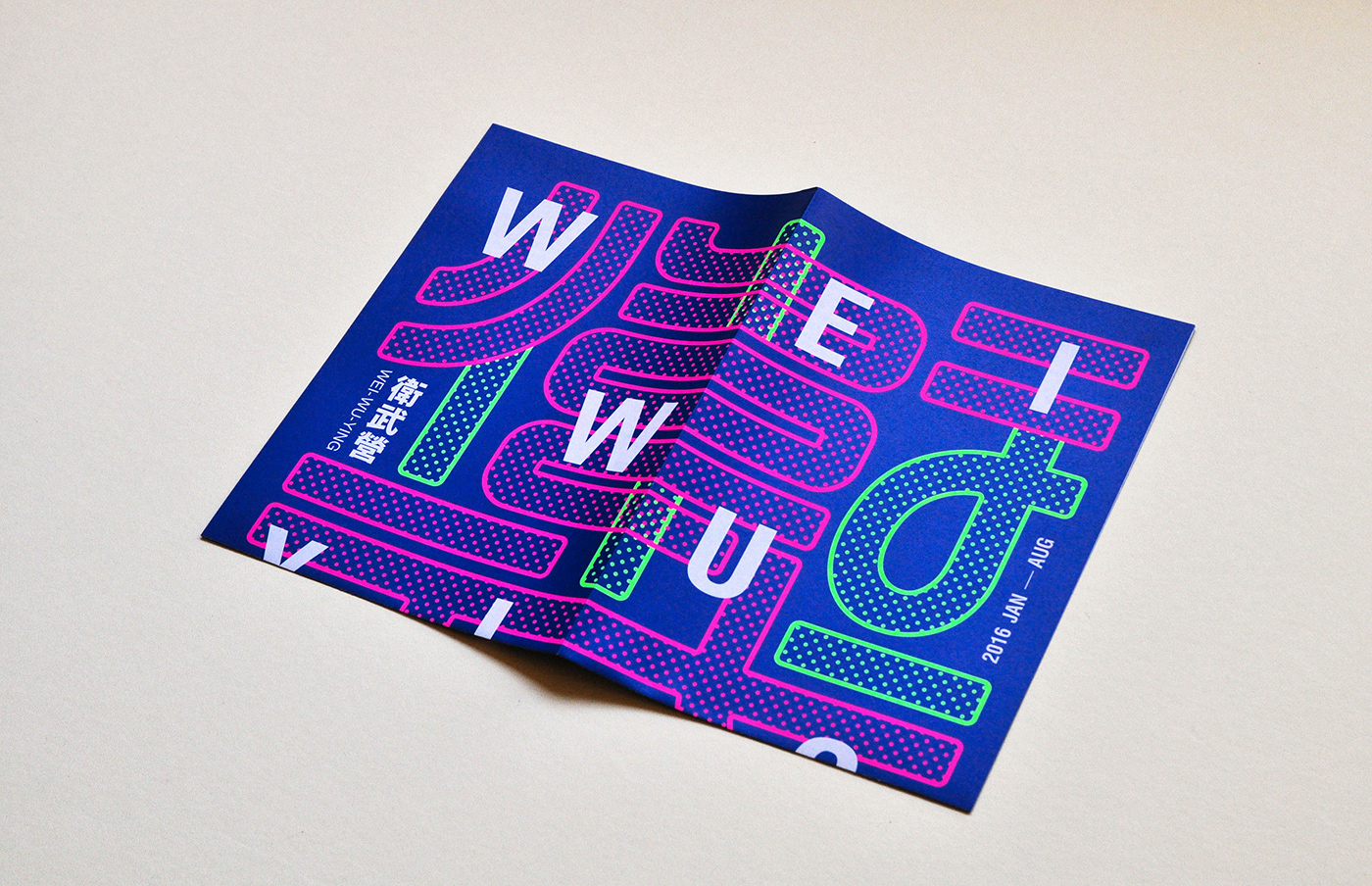
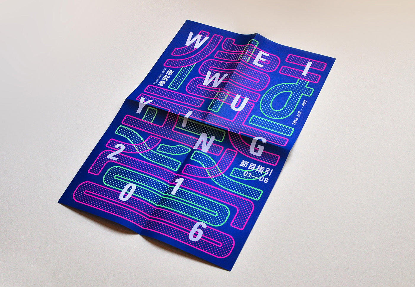
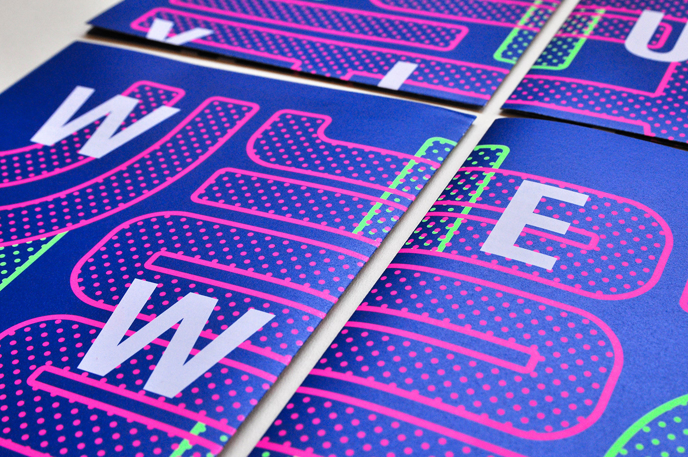
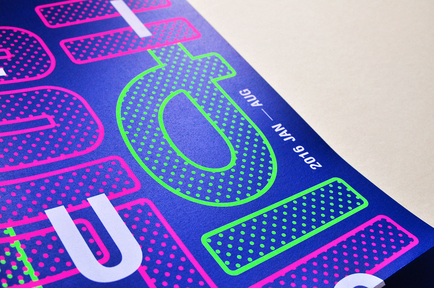
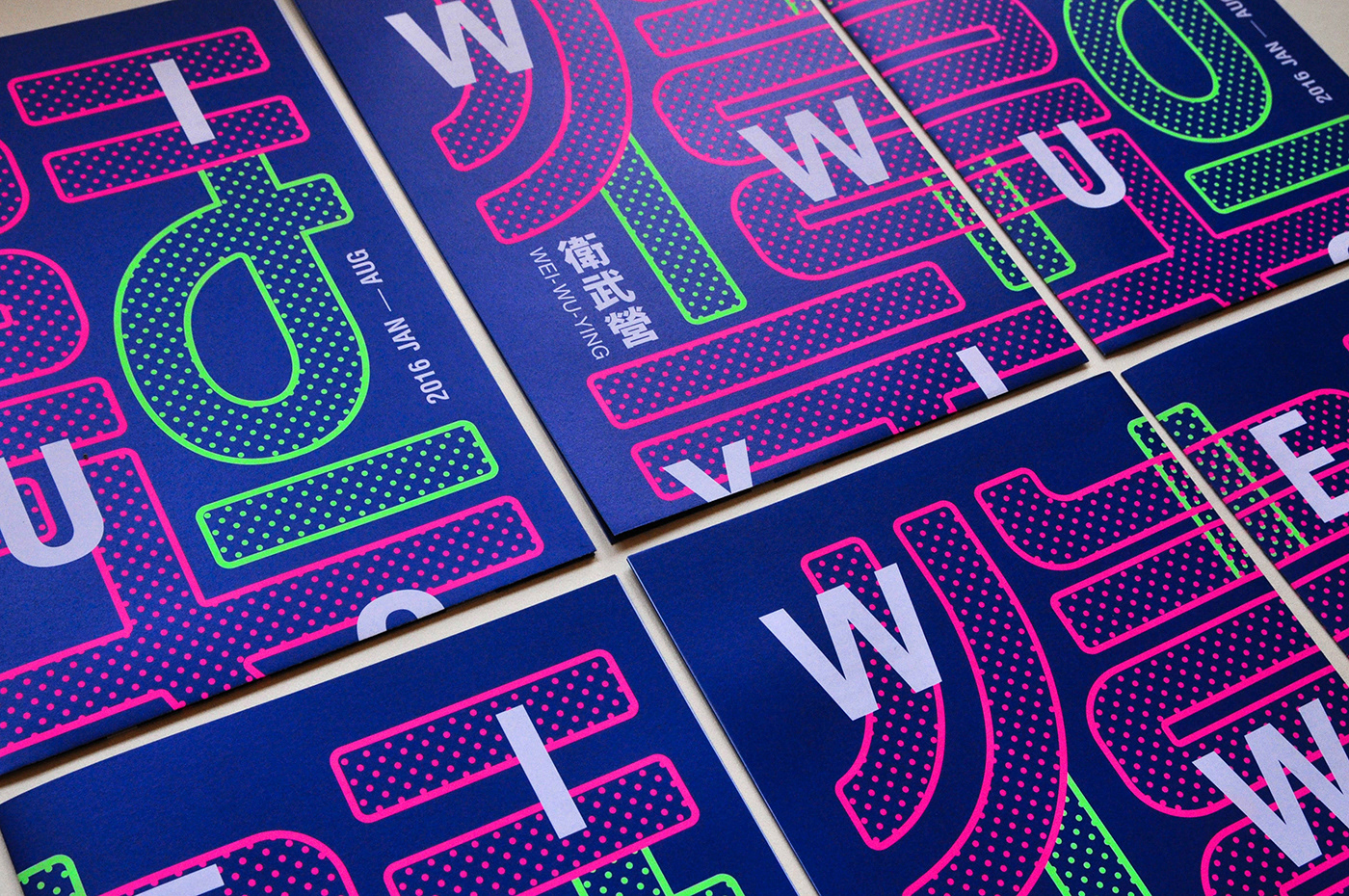
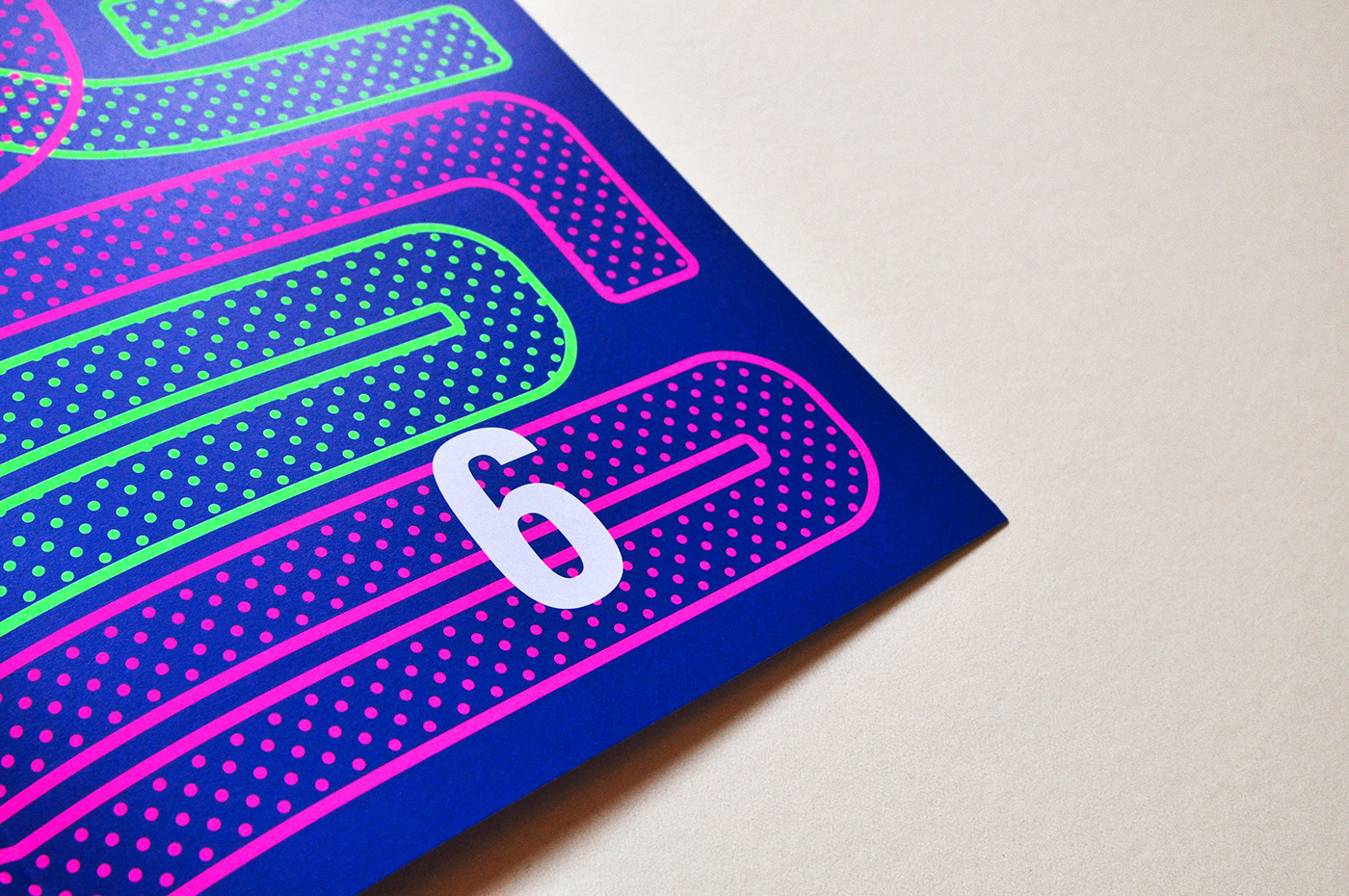
The shape of These 3 Chinese Characters, Wei-Wu-Ying, is inspired by the outline of the building structure. The curve lines from the characters response to the continuous outlines of the eaves. The bold colors that display as a avant-garde symbol of the building overlapping together to represent the shadows between the building and trees in the garden.
衛武營2016半年刊
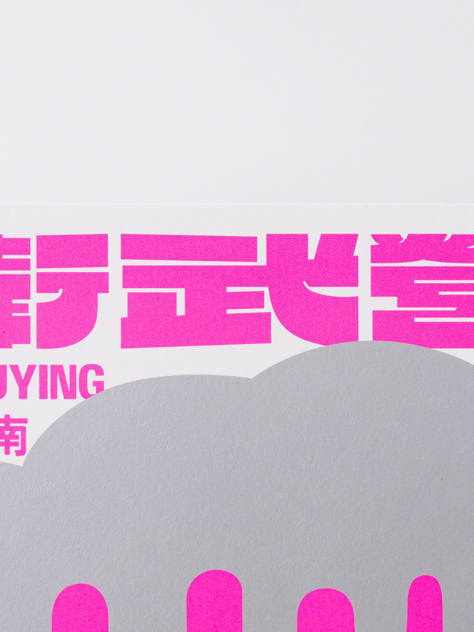
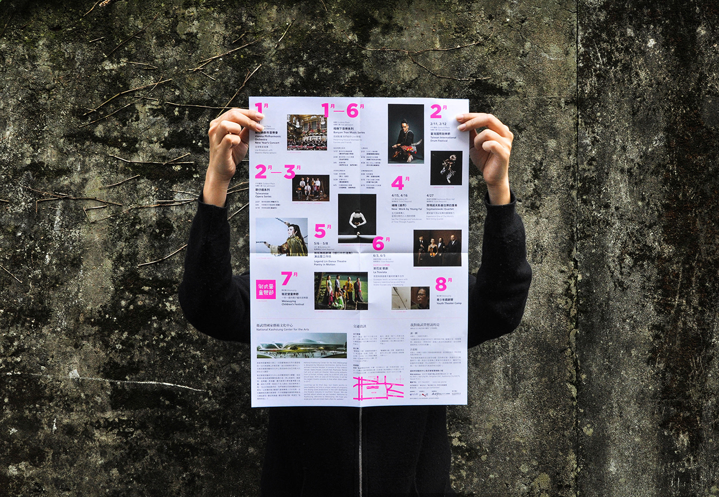
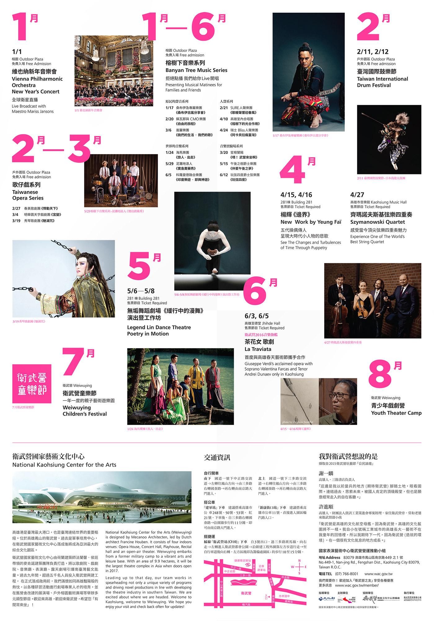
衛武營國家藝術文化中心,由荷蘭「麥肯諾建築師事務所」 法蘭韾.侯班 (Francine Houben) 與台灣羅興華建築師共同設計監造,建築啟發於原生的老榕樹群,連續起伏的曲面屋頂猶如樹冠,其內收納著四大展演空間與半開放的榕樹廣場,流暢的空間伸展自由曲面滑入大地,成為環境地景起伏的一部份。 衛武營 WEIWUYIN 2016 PROGRAM GUIDE 形象海報,目的作為一個銜接介面,在主體建設完成與正式啟動前的階段性概念與展演訊息溝通。規劃以「衛武營」漢字為表現,創造一個合作計畫,邀請不同藝術、設計創作者以不同的感受與角度料理這一主題,直至衛武營國家藝術文化中心正式開幕。洋蔥是計畫的第一個創作單位,取建築體連續曲面表現「衛武營」漢字造型、交錯的雙色圓點是灑落樹蔭間的點點光影、鮮豔顏色的是高雄炙熱陽光印象與建築師對光線的闡述,期許這建築與後續藝術內容的影響如這色彩,生活化地植入一顆實驗、大膽、強烈而充滿生命力的藝術種子於觀者。
CD: Andrew Wong
AD: Janett Wang
D: Cheng Jie Sung